Visa Subscription Manager
Refocusing a feature-heavy subscription tool around clarity and cardholder needs.
Role
Product Designer
Year
FY2026
Duration
12 weeks
Skills
Product strategy
Research
AI prototyping
Tools
Figma
Replit
User Testing
Maze
Team
Product Partners
Researchers
Content Designer
Front-end &
Back-end Developers
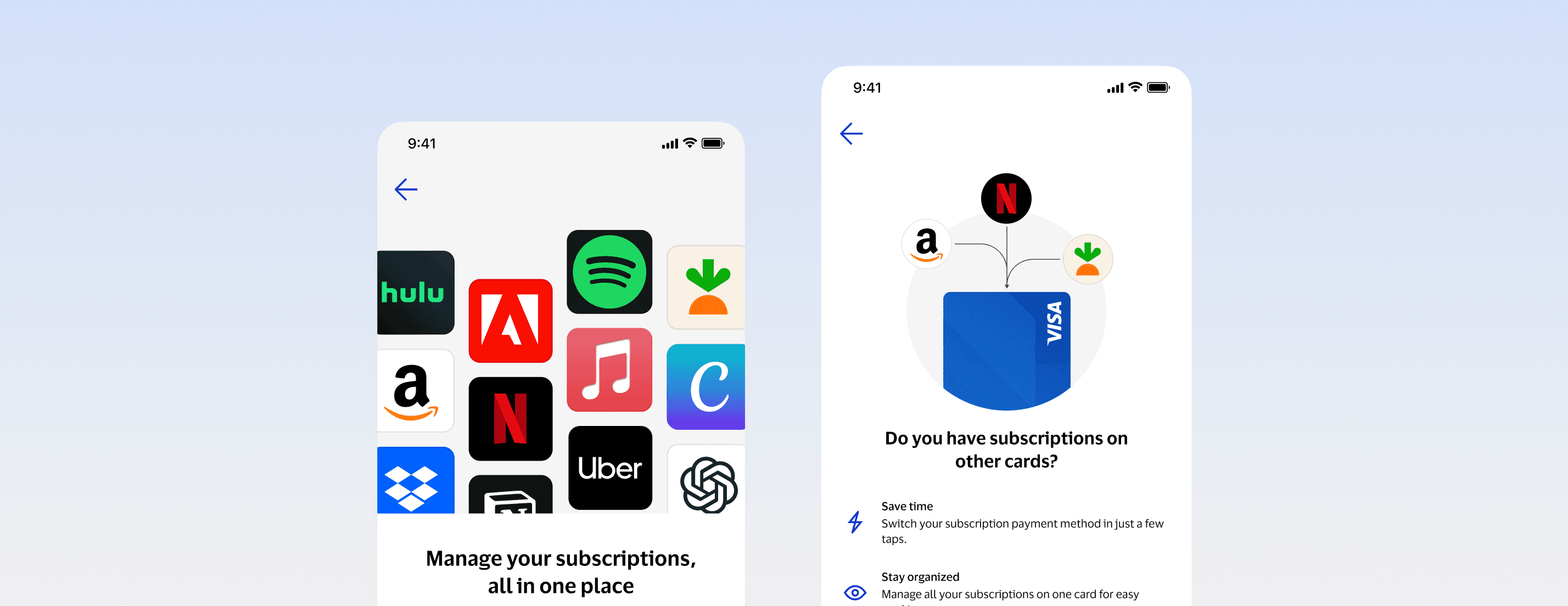
I simplified our subscription management feature set, creating reusable testing and validation frameworks for future SDKs.
Transformed limited payment-blocking functionality into comprehensive subscription management.
Aligned product strategy with user needs through comparative prototyping and testing.
Established scalable design patterns for Visa's SDK ecosystem.
Background
Why this, and why now?
EU regulation required subscription controls in card issuing apps. A partnership with Pinwheel, a third-party subscription data API, gave us the data to build them.
A redesign with no clear focus.
Product arrived with lo-fi wireframes and a direction they felt confident in. Most partners were new to the project and expected a simple visual refresh.
The layout followed the data model: calendar view, stored card tab, merchant categories, all competing for attention. It solved for completeness. I wanted it to solve for why people open a subscription tool.

Original designs lacked clarity on what users could and were expected to accomplish.
Early Validation
A small study changed the conversation.
Early design changes and referencing best practices weren't moving the needle, so I collaborated with our researchers on a rapid A/B test that compared products feature-full version and design's reduced proposal.

Running this nimble usability study gave us shared ground for conversation to steer product vision.
Cutting the noise gave us focus.
Using rapid AI prototypes, we tested these designs with a small sample of eight people, treating feedback as directional (not statistically significant). But it gave us something concrete to react to churning on shifting opinions.
The result? The overwhelming majority — 7 of 8 — were confused why a subscription tool listed every merchant their card was saved with. So, we cut the stored card feature. What was left did one job: show monthly spend and upcoming payments, and let people manage everything in one place.
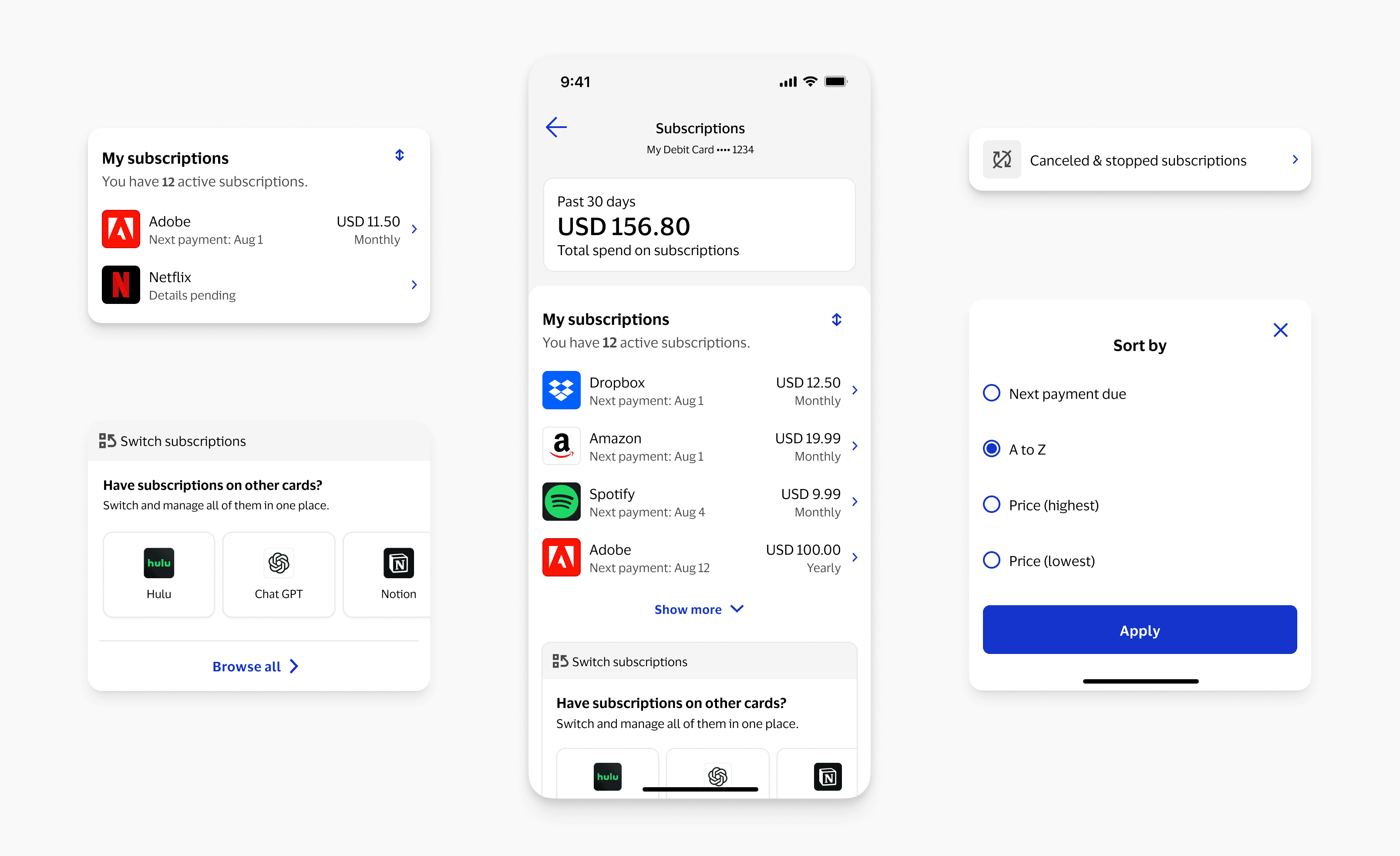
Running this nimble usability study gave us shared ground for conversation to steer product vision.
New Features & KPIs
Introducing a secondary feature without taking over the page.
Switch subscription, the feature Pinwheel unlocked, was a way to drive spend, so it became a primary KPI and a selling point for clients.
Product wanted it very visible, and one partner suggested a permanent link at the top. But it isn't why anyone opens this tool, so I asked one question: how annoyed would a skeptical user be seeing this here?
First time experience
Sparked by conversations with Liz, our researcher, I designed a first-time experience that introduces the feature set at first open. Even if people skip switch at first, they know it's there and get curious.
Feature card placement
Product still worried about discoverability, so the subscription list collapses into an accordion past four subscriptions. That pulls the switch card above the fold without making it the center of the page.
Creating consistent and repeatable patterns.
With Sara, our content designer, we rewrote the copy in plain language and added status icons and consistent confirmation modals.
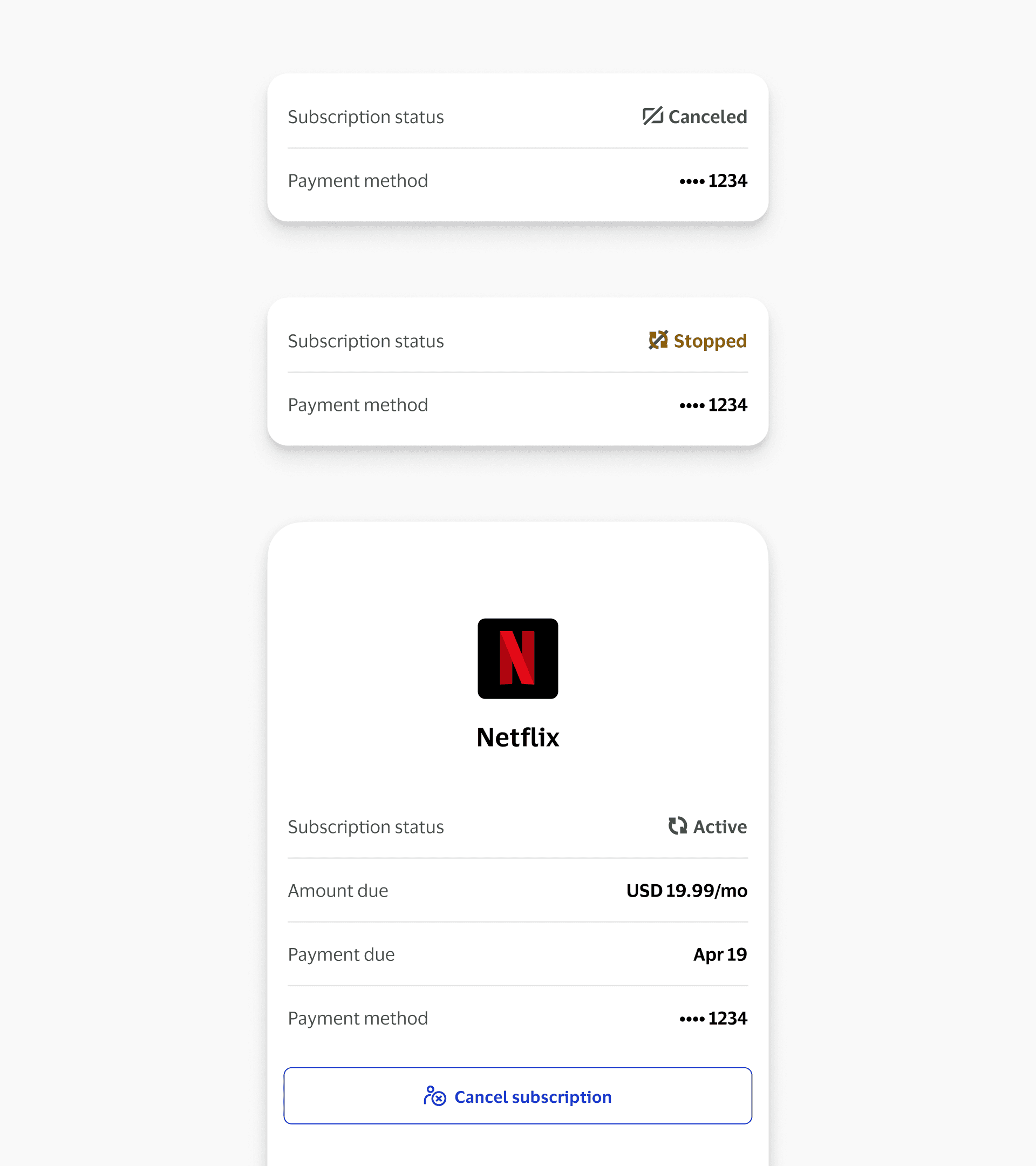
Visa Subscription Manager has shipped early FY2026, with new cancel and switch subscription support.
Key Takeaways
01
Shared evidence moves people faster than best practices
When opinions are set, explaining principles doesn't go far. An 8-person study gave everyone the same evidence and led us to cut two features. Next time I'd run that kind of research from day one as shared discovery, so it isn't a response to conflict.
02
Define the tradeoff, then design for both sides
Product partners wanted switch subscription front and center, but it isn't why people open the tool. We were able to create a shared way to weigh discoverability against focus, finding a balance between business and user priorities.
03
Know what's evidence and what's instinct
We tested placement, but the first-time experience came from intuition. I started follow-up research on the entry card after launch, and I'd want new-user testing on the first-time experience before feeling confident in it.
Special Thanks
Thanks to my manager Ian for the context from earlier work, product partners Sonam and Anna for working through disagreements with me, researchers Sandy and Liz for keeping the research fast and the goals user-centered, and content designer Sara for making the copy feel natural to everyday users.
Feedback
Josh’s creative vision, ability to handle ambiguity, and attention detail made all the difference. I truly appreciate his dedication and expertise throughout the entire process.
Anna Chwedczuk Sr. Manager • Product Management
Josh provided multiple iterations of cardholder UI/UX, taking feedback along the way and delivering an excellent visual that will be used in discussions with leadership up to the SVP level.
Aaryn Watson Director • Product Management